A Guide to Designing Compelling Fundraising Newsletters
In fundraising, stewardship pieces serve as vital bridges between organizations and their supporters, offering a glimpse into impactful stories, milestones, and the transformative power of contributions. While typography is a cornerstone of effective fundraising (see Keep Your Donors Reading: Typography Best Practice for Fundraising), design and imagery play equally vital roles in creating fundraising newsletters that resonate with donors.
Readers naturally gravitate toward elements that stand out with:
headlines that beckon them
captions that provide context
bolding and underlining that emphasizes key points
concise one-line sentences that deliver impactful messages
call-outs that highlight essential information
heartfelt testimonials that resonate
thought-provoking quotes that inspire
and postscripts that leave a lasting impression
Just as a compelling letter captures attention, a well-designed newsletter captivates and guides readers through a visual journey.
The Scanner's Gaze and Visual Hierarchy
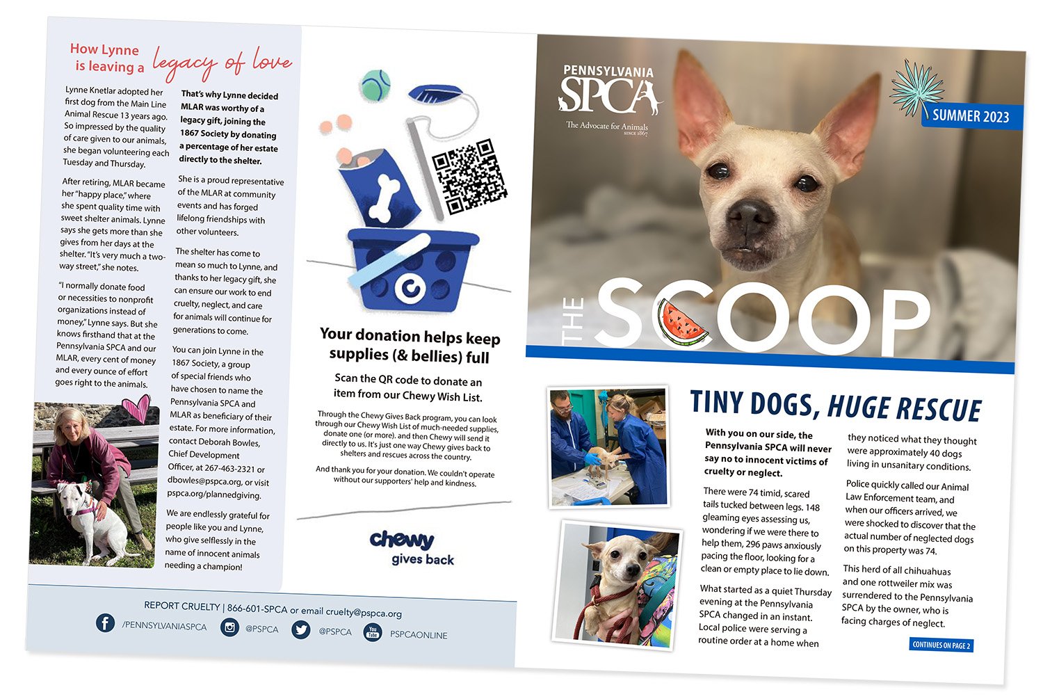
In an era of information overload, donors often scan content before engaging further – this is where the art of photo selection shines. Compelling imagery acts as a guide, directing the scanner's gaze toward the heart of the story. A well-chosen photograph can halt scanning eyes, drawing them into the narrative and encouraging deeper engagement.
Siegfried Vögele, a renowned expert in the field of direct marketing and graphic design, emphasizes the importance of creating clear focal points on a page. These are areas readers' eyes naturally gravitate to when they first glance at a page. Typically, headlines, images, and captions serve as focal points. Placing important content in these areas ensures that readers are immediately drawn into the material.¹
Vögele also advocates for the use of a well-defined hierarchy in layout design. This involves structuring content in a way that guides readers from the most important information to secondary details. Headlines, subheadings, and body text should all contribute to a logical hierarchy that helps readers navigate the page.
Stewardship Illustrated
Stewardship is not confined to words alone. Visual storytelling through imagery and infographics adds layers of authenticity and emotion words can't always capture. Carefully chosen photographs showcasing the people, places, and lives positively affected by donations breathe life into these pieces. Through images, donors witness the tangible impact of their generosity, cultivating a sense of pride and connection.
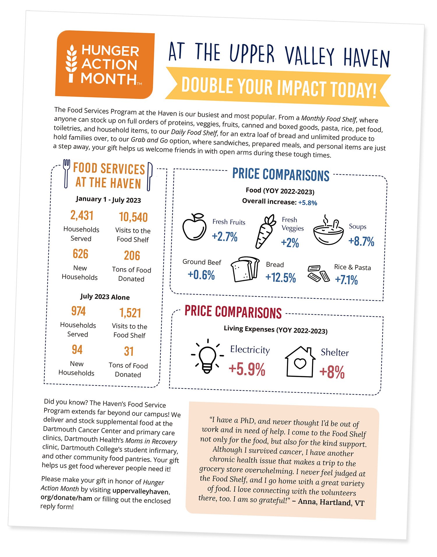
Nonprofit organizations often deal with complex social issues and data. Infographics allow you to convey your mission, goals, and impact through compelling visual narratives. Instead of overwhelming supporters with statistics and lengthy reports, nonprofits can use infographics to tell powerful stories that resonate emotionally.
Typography and Imagery — A Harmonious Duo
While typography communicates the message, imagery provides the emotional context. The right combination of fonts and photographs can create a story that captures the donor’s attention and heart. A headline accompanied by a poignant image creates a compelling narrative that lingers in the donor's mind, reinforcing the cause and its significance.
Strategic Photo Selection and Visual Impact
Photo selection is an art form in itself. Each image should contribute to the narrative, evoke emotions, and align with your organization's mission. Candid shots capturing genuine moments of connection speak louder than staged visuals. By selecting images that encapsulate the essence of your cause, fundraising newsletters forge a connection between donors and beneficiaries.
Color Palette and Imagery
The interplay between imagery and color is a dynamic design facet often overlooked. When possible, photographs should resonate with your organization’s brand colors, creating a cohesive and immersive visual experience. This fusion reinforces the emotional impact and the overall design aesthetic.
Don’t forget about these basic design principles:
Choose legible and appropriate fonts for headlines, subheadings, and body text.
Use whitespace effectively to create breathing room between elements. This enhances readability and prevents the design from feeling cluttered.
Choose a color palette that aligns with your organization’s brand guidelines. Use color strategically to guide readers’ attention and create visual interest.
Use columns to organize content and improve readability. Columns create a sense of structure and order.
Conclusion
The art of design and imagery within fundraising newsletters is a tapestry woven from passion, empathy, and creativity. It is a testament to the power of visual storytelling, a reminder that a single image can speak volumes and inspire change. Remember that a thoughtfully designed donor newsletter holds boundless potential to connect hearts and inspire action.
1 Handbook of Direct Mail, Siegfried Voegele, Prentice Hall, 1992


